
Making Images Responsive
When adding an image into the Page Editor, the editor will assign a pixel width and height to the image. You can see this when you right click on an image and view the Image Properties. The default behavior of assigning an image a pixel size prevents the image from getting smaller on a mobile phone-sized screen, which causes the entire web page to be wider then the screen on smaller devices. The screen size for a Legionsite web page can be as small as 320 pixels wide on a phone, to 1200 pixels on a desktop computer. Basically, any image that is greater than 320 pixels in width will prevent a website from fitting well on a phone. The main solution to this problem is to use percentages to size the image rather than pixels.
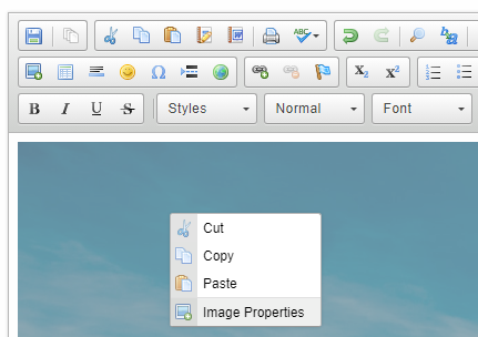
Right click on the image, then select "Image Properties"
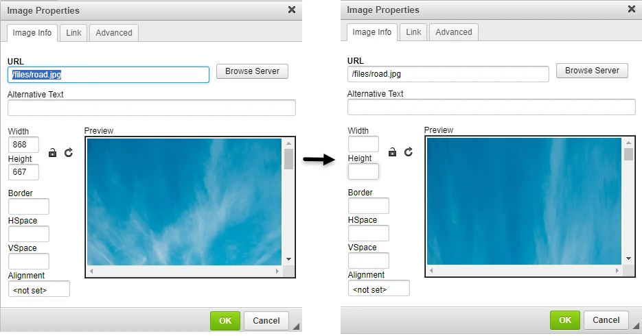
Remove the width and height values.
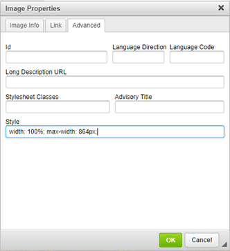
Click on "Advanced," and under the "Style" input add the width as 100%, and a max-width of the desire pixel size.
This "Style" input is used for additional styles. The max-width
setting sets an upper limit and prevents the image from increasing beyond that width. This max-width should never be more than the actual width of the image, or 1200 pixels (for larger images that are wider than the viewing area of the website). The 100% width setting will prevent the image from increasing to more than the max-width setting while also allowing the image to shrink to the size of the screen on smaller devices. A height setting is not needed as it will automatically resize proportionally.
Remember, any image can be given a max-width setting that is smaller than its actual width, but it should never be given a value larger than its actual width.